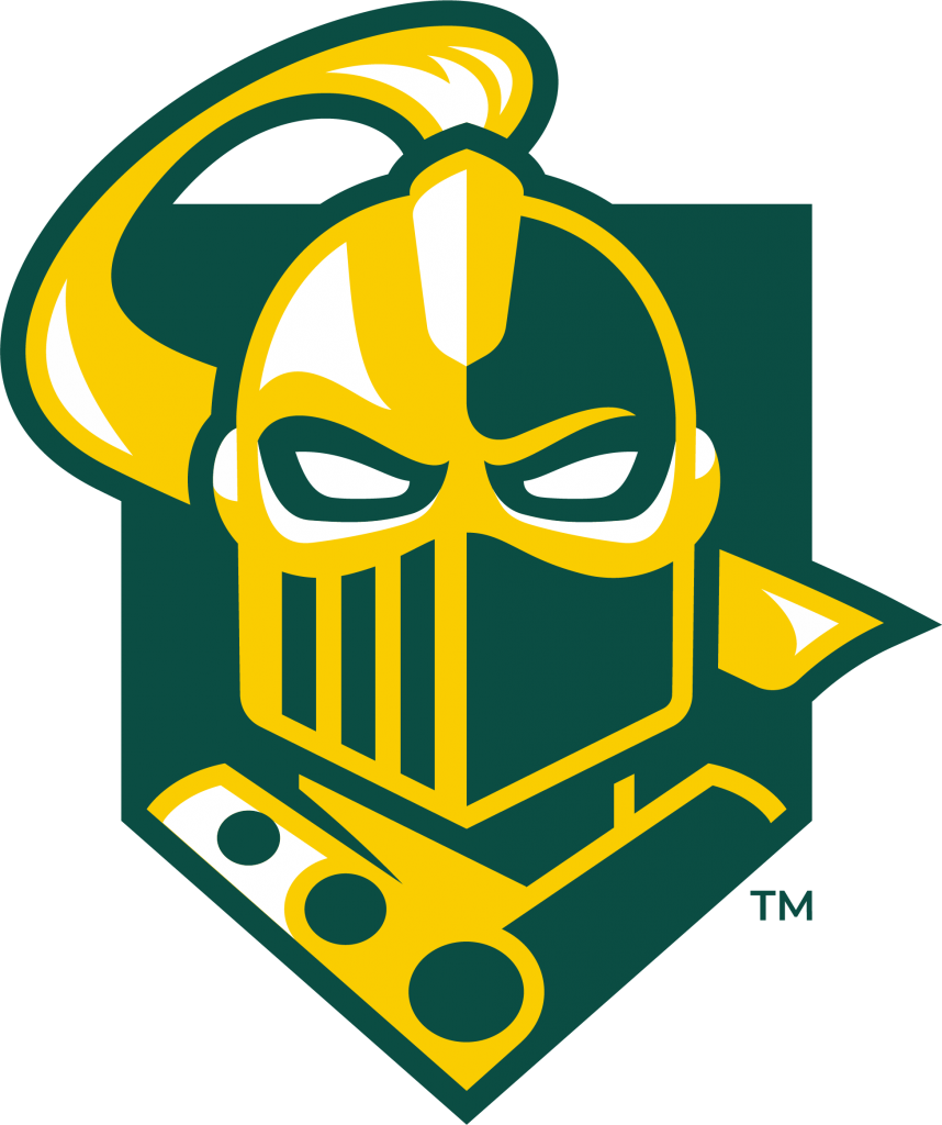
Clarkson University and its Department of Athletics & Recreation today officially unveiled a bold, revitalized visual identity for its Golden Knight mascot and athletic programs.

“The new look for the Golden Knights is iconic, bold, and simplified. It honors our history while looking to the future and next generation who want to rigorously compete at a high level,” said Scott Smalling, Director of Athletics and Recreation. The updated identity was ushered in with the arrival of fall sports teams to campus over the weekend.
Based on extensive engagement with students and sports teams, the comprehensive redesign includes a distinct logo, new wordmark, and exclusive font style created especially for the next generation of Clarkson student-athletes as well as the campus at large that embraces the Golden Knight across its club and academically-related teams.
Clarkson worked with student-athletes to get their feedback throughout the redesign process, and tailored the logo to that feedback. “Proud, respected, strong, fierce, forward-facing, and modern were all themes that were consistently in the discussion and survey process,” said Laurel Kane, Associate Director of Athletics & Recreation, who led many of the student interactions with the coaching staff.
The new logo features a sleek knighthead, facing forward. The design pays tribute to the University’s rich history and tradition such as echoing the annulets from the Clarkson family shield and modernizes the look through graphics and lettering that will be used on athletic gear, signage, and other informational materials.
Merchandise in this new line up is now available in the Clarkson University Bookstore. More activities to introduce the new mascot design and logo are planned as students arrive on campus and with alumni throughout the year.
Click here for a shareable link: https://www.clarkson.edu/news/clarkson-university-unveils-new-golden-knight-mascot-athletics-logos